
The waiting-area display can do more than show token numbers
A waiting-room screen is not only a queue endpoint. Used thoughtfully, it can reduce uncertainty and make shared time more useful.
 Patient Experience
A waiting room is shaped by more than the number of minutes a patient spends there.
It is shaped by what the patient knows during those minutes.
Have they been registered correctly? Is the queue moving? Did they miss their token? Has the doctor been delayed? Should they remain seated or move to another area?
When none of this is clear, even a reasonable waiting time can feel longer.
Patients begin watching the reception desk, listening for names and asking staff for updates. Reception teams repeatedly answer the same questions while also managing new arrivals, calls, payments and clinical coordination.
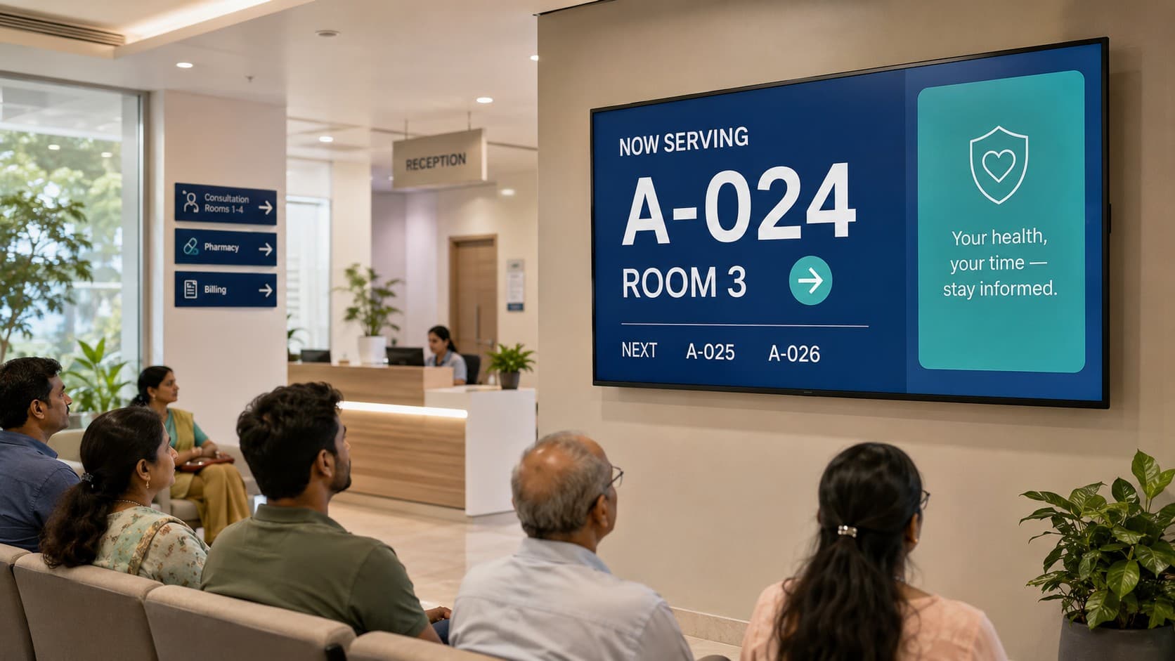
A thoughtfully designed waiting-area display can reduce much of this uncertainty.
Its primary role may be to show token numbers, but its broader purpose is communication. It can reassure patients that the queue is active, guide them to the correct destination, reduce avoidable interruptions and make shared screen time more useful.
The display is not simply a television mounted on a wall. It is part of the patient experience.
Waiting feels longer when nothing is clear
A patient may understand that a busy clinic cannot always run exactly on schedule. Emergency cases occur, consultations take different amounts of time and clinicians occasionally need to spend longer with someone who requires additional attention.
What is harder to accept is silence.
When patients cannot see whether the queue is moving, they may assume they have been forgotten. If there are multiple doctors or service counters, they may not know which queue applies to them. A patient who briefly steps away may worry that their turn has already passed.
This uncertainty creates stress for patients and additional work for staff.
A clear display can answer several basic questions without requiring a conversation:
- Which token is currently being called?
- Where should that patient go?
- Which tokens are coming next?
- Is the queue active?
- Has a previously called token been recalled?
- Is there an important delay or temporary change?
The display does not eliminate waiting, but it makes waiting easier to understand.
That distinction matters. People are often more comfortable with a visible delay than with an unexplained one.
Clarity comes before content
The primary job of a healthcare waiting-area display is operational communication.
Token information should remain large, high-contrast and visible from across the room. Patients should not have to search through advertisements, videos or decorative animations to discover whether their number has been called.
The most important information should dominate the visual hierarchy:
- The current token or queue number
- The destination, room or counter
- The next relevant tokens, when appropriate
- A clear visual indication when a new token is called
Audio cues can support the display, particularly for patients who are not continuously looking at the screen. However, audio should remain clear and restrained. Repetitive sounds, excessive volume or overlapping announcements can quickly make the waiting environment more stressful.
Useful design principles include:
- Keep the current call and destination visually dominant
- Use large type that remains readable from the farthest seat
- Maintain strong contrast between text and background
- Use colour to support meaning, not as the only indicator
- Keep movement purposeful and restrained
- Provide multilingual instructions where the setting requires them
- Avoid unnecessary flashing or rapidly changing content
- Keep the queue visible even when secondary media is playing
- Avoid displaying names or clinical details unnecessarily
A display succeeds when people can understand it with a brief glance.
Design for the room, not only the screen
A display may look excellent on a designer’s monitor and still perform poorly in an actual waiting area.
Healthcare environments introduce practical considerations:
- The screen may be mounted above normal eye level
- Patients may sit at different angles and distances
- Bright daylight may reduce contrast
- Older patients may need larger text
- Some people may have impaired vision or hearing
- The room may already contain competing sounds
- Patients may speak different languages
- The display may need to serve multiple doctors or service points
The design should therefore be tested in the physical space where it will be used.
Stand at the farthest seat. Check whether the current token is immediately recognisable. View the screen from the side. Test it during bright daylight. Listen to the announcement volume when the room is both quiet and busy.
A waiting-area display is an environmental interface. Its quality depends on how well it communicates across the whole room, not merely how attractive it appears in a screenshot.
Make shared screen time useful
Once queue information is clear and consistently visible, the remaining display space can support other useful communication.
This does not mean filling every available area with promotional content. Patients already face a considerable amount of information during a healthcare visit. Secondary content should earn its place on the screen.
Useful content may include:
- Preparation instructions for commonly performed investigations
- Short preventive-health messages
- Seasonal health guidance
- Infection-control reminders
- Information about available hospital services
- Directions to pharmacy, billing or diagnostic areas
- Guidance about documents required for registration or insurance
- Instructions for collecting reports
- Important changes in clinic timings
- Emergency or operational announcements
The best secondary content is concise, relevant and easy to understand without sound.
A patient should be able to look at the screen briefly, understand the message and return their attention to the queue.
Long paragraphs, crowded slides and rapidly changing information are unlikely to be useful. A small number of carefully designed messages will usually communicate more effectively than an endless media playlist.
Content should match the location
Not every healthcare display should show the same information.
An outpatient waiting area serves a different purpose from a pharmacy, diagnostic department, physiotherapy area or inpatient billing counter.
For example:
- An outpatient display can explain appointment flow and preventive care
- A laboratory display can show preparation guidance and collection instructions
- A radiology display can present safety and scheduling information
- A pharmacy display can explain medication collection and counselling
- A billing display can provide payment and insurance guidance
- A discharge area can show follow-up and document collection reminders
Content becomes more useful when it reflects the questions people are likely to have in that location.
Scheduling can also improve relevance. A clinic may display one set of messages during morning outpatient hours and another during an evening specialty session. Seasonal guidance can appear only when appropriate.
This does not require a complicated broadcasting operation. Simple location-based and time-based controls may be enough to keep the content relevant.
Privacy is part of the design
A waiting room is a public environment.
Anything displayed on the screen may be visible to patients, visitors, vendors and staff who are not directly involved in a particular person’s care. The display should therefore reveal only the minimum information necessary to guide the correct patient.
Token numbers are often more appropriate than full patient names. However, even token use should reflect the organisation’s workflow and privacy requirements.
Displaying a consultation type, diagnosis, test name or clinical destination may reveal more than intended. A seemingly harmless label can expose sensitive information when viewed in context.
A privacy-conscious display should consider:
- Whether a token number alone is sufficient
- Whether the destination reveals sensitive information
- How long a completed token remains visible
- Whether previous queue information should be removed
- Who is authorised to control announcements
- Whether screen content is logged or stored
- What appears when the queue system is unavailable
- Whether screenshots or recordings could expose patient information
Privacy should not be added after the visual design is complete. It should guide what the display is allowed to communicate from the beginning.
Staff need simple operational controls
Even a well-automated queue requires human control.
A patient may miss a call. A consultation room may temporarily close. Someone may need to be redirected. An emergency announcement may need to interrupt normal content. A doctor’s queue may pause while another continues.
Staff should be able to handle these exceptions without navigating a complicated administrative system.
Useful controls may include:
- Recall the current token
- Call the next token
- Redirect a token to another room or counter
- Pause a specific queue
- Temporarily hide secondary media
- Display an urgent announcement
- Adjust announcement volume
- Enable or disable patient names
- Change refresh and rotation intervals
- Confirm whether the display is connected and active
These controls should be available only to appropriate users, but they should remain easy to understand.
A digital display becomes unreliable when staff avoid using it because every exception requires technical support.
The display should reflect the live workflow
A queue screen is only as reliable as the information feeding it.
If staff call patients in one application while the display depends on manually updated information somewhere else, the screen can quickly become inaccurate. Once patients stop trusting it, they return to asking reception for updates.
The display should therefore connect to the same operational workflow used to manage appointments and patient movement.
When a token is called, redirected, completed or recalled, the change should appear automatically. If there are multiple doctors, counters or service areas, the display should understand the relevant queue context.
A connected display can also help staff coordinate movement:
- Reception can see whether a patient has been called
- Clinical teams can understand who is waiting
- Patients can identify the correct destination
- Missed tokens can be handled consistently
- Queue changes become visible without repeated verbal announcements
The goal is not simply a more attractive screen. It is a screen that accurately represents what the organisation is doing.
Avoid turning the waiting room into an advertising channel
Shared display space can be commercially attractive, but healthcare environments require restraint.
Patients may be anxious, uncomfortable or waiting for important information. Loud advertising, constant movement or unrelated promotional content can make the environment feel less considerate.
Secondary content should support the setting rather than compete with it.
Before adding something to the display, ask:
- Is this relevant to people in this room?
- Is it appropriate in a healthcare environment?
- Could it distract from the queue?
- Does it create unnecessary anxiety?
- Is the message understandable without audio?
- Does it help the patient or mainly fill available space?
The fact that a screen has unused space does not mean every part of it needs to be active.
Visual calm is also a form of communication.
Measure what improves the experience
The value of a waiting-area display should not be measured only by whether the screen is switched on.
Organisations can look for practical improvements:
- Fewer routine queue enquiries at reception
- Fewer patients missing their call
- Reduced confusion about rooms and counters
- Better visibility of delays or operational changes
- Improved staff coordination
- Greater patient understanding of the waiting process
- Better recall of useful health information
- Fewer privacy concerns or inappropriate disclosures
Patient and staff feedback can be particularly useful.
Patients can explain whether the information was visible and understandable. Reception teams can identify the questions they continue to receive. Clinical staff can report whether token movement reflects the actual workflow.
A display should evolve according to how the room uses it.
A small interface with a broad effect
The waiting-area display is one of the few digital touchpoints visible to many patients at the same time.
It can make an organisation feel calm and coordinated—or expose operational confusion very publicly.
When the display is connected to reliable queue information, it reassures patients that they have not been forgotten. When its design prioritises clarity, people can understand what is happening without repeatedly approaching reception. When secondary content is chosen thoughtfully, waiting time can become a useful opportunity for communication.
The screen does not need to be visually loud to be valuable.
It needs to be accurate, readable, respectful and relevant.
A patient may still need to wait, but they should not have to wait without information. A thoughtful waiting-area display makes the process visible, protects privacy and helps the organisation communicate as one coordinated service.